In contemporary luxury outdoor design, color is far more than a visual decision—it is a strategic tool that defines atmosphere, enhances materiality, and shapes the overall spatial experience. For outdoor designers, architects, and luxury design studios, selecting the right palette is essential to achieving cohesion between architecture, landscape, and furniture.
Unlike interior spaces, outdoor environments must respond to natural light, seasonal changes, and surrounding context. As a result, color palettes in luxury outdoor design are often restrained, layered, and deeply connected to materials. When executed effectively, they create environments that feel timeless, immersive, and effortlessly sophisticated.
The Role of Color in Outdoor Spatial Experience
Color in luxury outdoor design operates at multiple levels. It influences perception, highlights architectural lines, and enhances the interaction between light and material. Neutral tones often serve as a foundation, allowing textures and forms to take precedence.
However, color is not limited to surfaces. It emerges through natural elements such as planting, sky reflections, and water features. This dynamic quality requires designers to think beyond static palettes and consider how colors evolve throughout the day.
Ultimately, successful outdoor color strategies balance visual harmony with subtle contrast, ensuring that spaces remain engaging without becoming overwhelming.
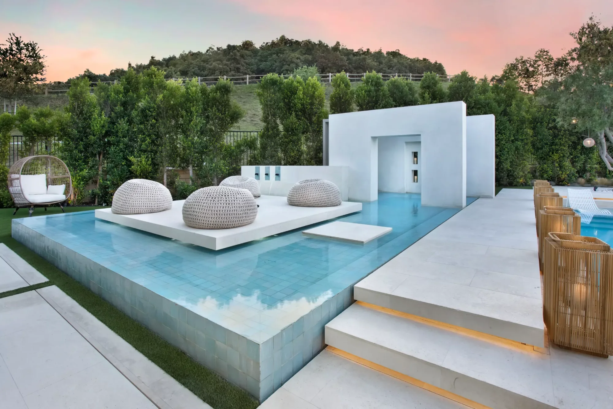
Neutral Foundations for Timeless Elegance
A neutral palette forms the backbone of many luxury outdoor design projects. These tones provide flexibility, allowing designers to layer materials and introduce variation without disrupting cohesion.
Key neutral palette elements include:
- Warm whites and off-whites for walls and architectural surfaces
- Soft beige and sand tones inspired by natural landscapes
- Light gray and stone hues for paving and structural elements
- Taupe and muted earth tones for furniture and textiles
- Subtle variations in tone to create depth without contrast
This approach ensures longevity, as neutral palettes remain relevant across changing design trends while enhancing the perception of space and light.
Earth-Toned Palettes and Natural Integration
Earth tones are central to luxury outdoor design, particularly in projects that emphasize connection to the surrounding environment. These palettes draw inspiration from soil, stone, vegetation, and natural landscapes.
Colors such as terracotta, ochre, olive green, and deep brown create a warm and grounded aesthetic. They work particularly well in Mediterranean, desert, and tropical settings, where the landscape itself becomes a primary design reference.
By aligning color choices with natural surroundings, designers achieve a seamless integration between built and organic elements. This approach enhances authenticity and reinforces the overall sense of place.
Monochromatic Schemes for Architectural Clarity
Monochromatic palettes are increasingly popular in high-end outdoor environments. By focusing on a single color family, designers can emphasize form, proportion, and materiality.
Typical strategies include:
- Using varying shades of gray to highlight architectural geometry
- Layering different finishes within the same tonal range
- Combining matte and reflective surfaces for subtle contrast
- Introducing texture to prevent visual flatness
- Maintaining consistency across architecture and furniture
These schemes create a sense of calm and sophistication, allowing the design to feel cohesive and intentional.
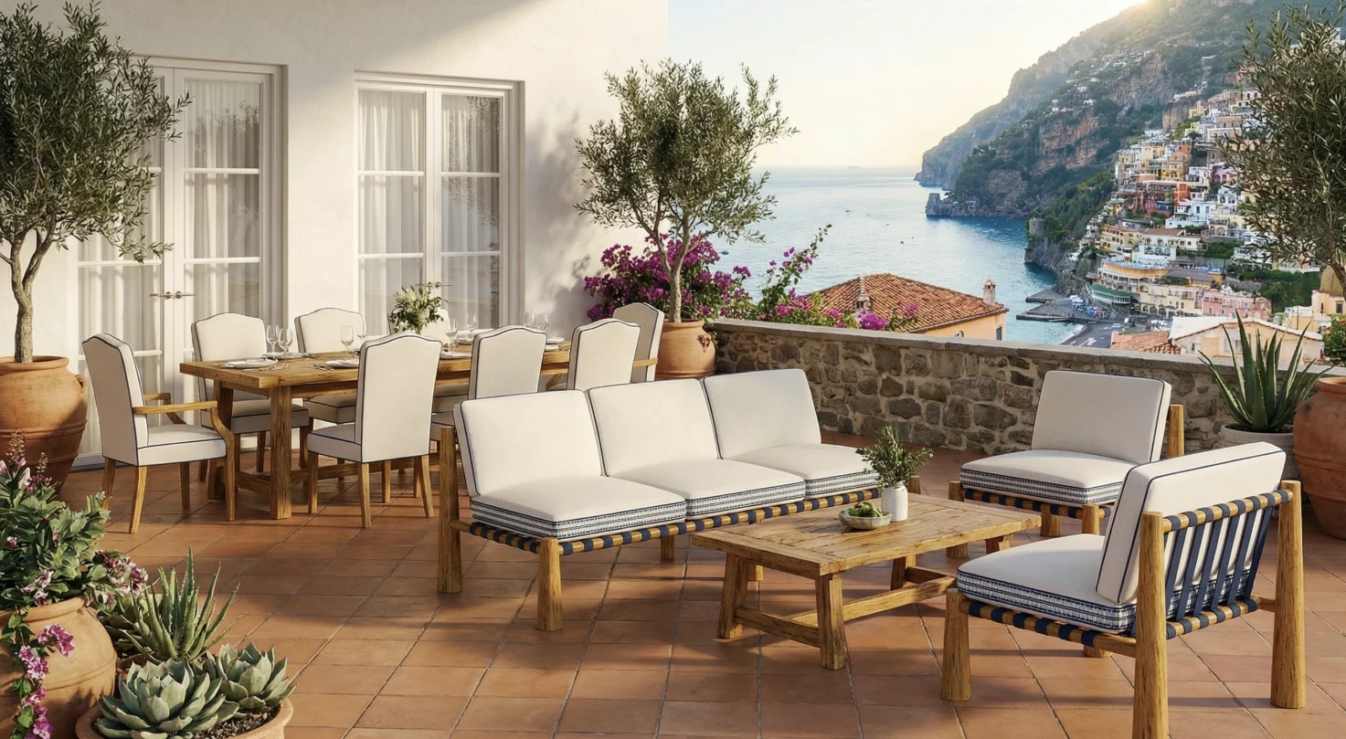
Coastal Palettes Inspired by Sea and Sky
Coastal environments naturally influence luxury outdoor design, particularly in seaside residences and hospitality projects. Color palettes in these settings often reflect the tones of the sea, sky, and sand.
Soft blues, pale aquas, and crisp whites create a fresh and airy atmosphere. These colors are typically balanced with neutral bases to avoid excessive contrast. Accents may include weathered wood tones or subtle metallic finishes that echo coastal elements.
This palette enhances the connection to the environment, reinforcing the experiential quality of outdoor living spaces while maintaining a refined aesthetic.
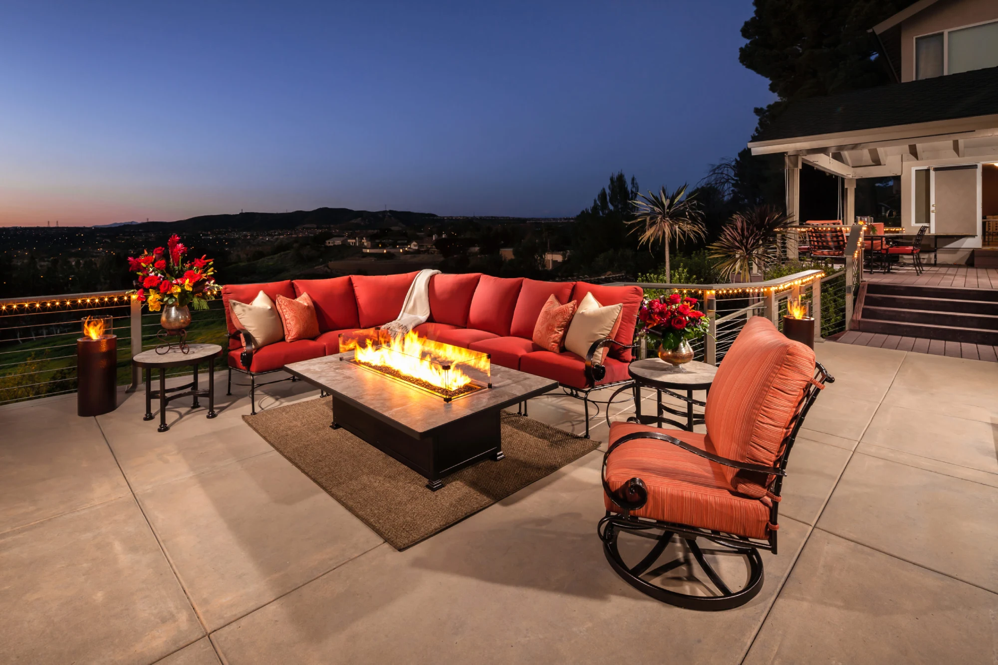
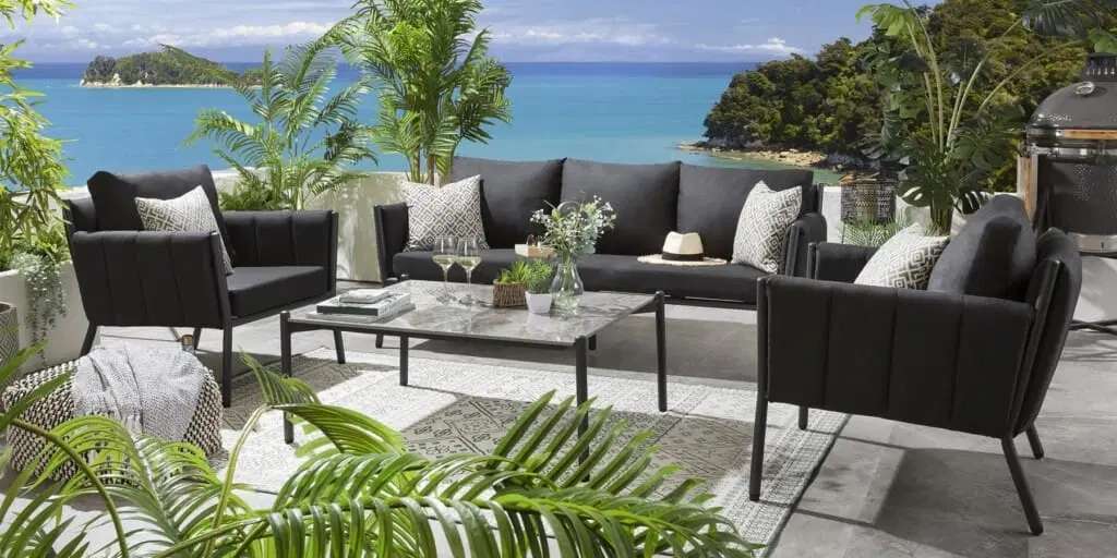
Dark Contrasts and Contemporary Luxury
While lighter palettes dominate many outdoor environments, darker tones are increasingly used to introduce contrast and depth in luxury outdoor design. Charcoal, deep gray, and black elements can anchor a space and highlight surrounding materials.
Design applications often include:
- Dark metal frames for outdoor furniture
- Charcoal stone or concrete for feature walls
- Black accents in lighting and architectural details
- Contrasting dark elements against lighter surfaces
- Using shadow as an extension of the palette
When used strategically, dark tones add sophistication and create a strong visual identity without overwhelming the space.
The Role of Planting in Color Composition
Planting plays a crucial role in defining color palettes within luxury outdoor design. Unlike fixed materials, vegetation introduces seasonal variation and organic movement.
Designers often use planting to soften architectural lines and introduce subtle color shifts. Greens dominate, but variations in leaf texture and tone create depth. Flowering plants may be used sparingly to add controlled accents without disrupting the overall palette.
This approach ensures that landscapes remain cohesive while still offering visual interest and dynamism throughout the year.
Outdoor Furniture and Color Harmony
Furniture selection is integral to maintaining color consistency in luxury outdoor design. Rather than introducing competing tones, furniture typically reinforces the primary palette.
Key considerations include:
- Selecting upholstery that complements architectural finishes
- Using neutral or muted tones for larger pieces
- Introducing subtle color variation through cushions and accessories
- Coordinating materials such as wood, metal, and fabric
- Ensuring durability without compromising aesthetic quality
By aligning furniture with the overall color strategy, designers create a unified and polished outdoor environment.
Lighting and Its Influence on Color Perception
Lighting significantly affects how color is perceived in outdoor spaces. Natural daylight enhances certain tones, while artificial lighting can alter their appearance entirely.
Warm lighting tends to enrich earth tones and create a welcoming atmosphere. Cooler lighting, on the other hand, can emphasize modern materials and sharper contrasts. Designers must consider both daytime and nighttime conditions when developing a color palette.
This dual approach ensures that luxury outdoor spaces maintain their intended aesthetic across different lighting scenarios.
Creating Cohesion Across Design Elements
Achieving cohesion is one of the primary challenges in luxury outdoor design. Color plays a central role in unifying architecture, landscape, and furniture into a coherent whole.
Designers often establish a primary palette and then introduce secondary tones in a controlled manner. Repetition of key colors across different elements reinforces visual continuity, while subtle contrasts add depth.
This balance between consistency and variation defines successful high-end outdoor environments, ensuring that every element contributes to the overall composition.
The Future of Color in Luxury Outdoor Design
As outdoor living continues to evolve, color strategies in luxury outdoor design are becoming more nuanced. Designers are exploring sustainable materials, innovative finishes, and new ways to integrate natural elements into color palettes.
At the same time, there is a growing emphasis on timelessness. Rather than following short-term trends, luxury projects prioritize palettes that remain relevant over time. This approach aligns with broader industry shifts toward sustainability and long-term value.
For architects and designers, mastering color selection will remain a critical skill in creating sophisticated and enduring outdoor environments.
Conclusion
Color is a defining element in luxury outdoor design, shaping both the visual and experiential qualities of a space. From neutral foundations to bold contrasts, each palette offers unique opportunities to enhance architecture and landscape.
For outdoor designers, architects, and luxury studios, the key lies in balance—combining materials, light, and color in a way that feels cohesive and intentional. As the demand for refined outdoor living grows, thoughtful color strategies will continue to play a central role in delivering truly exceptional design.